Top UI Libraries for Building Stunning UIs in Vue 3 and Nuxt 3
Charles Allotey | January 26th, 2024 | 12 min read
Building elegant and performant user interfaces (UIs) has become a crucial factor in web development. In the Vue.js ecosystem, both Vue 3 and Nuxt 3 provide robust tools for crafting dynamic and engaging applications. Choosing the right UI library can significantly enhance your development experience and elevate your final product.
Why Do I Need a UI Library?
Making UI components can take a lot of time and distract you from the main functions of your project. That's where UI libraries come in handy, like a superhero in shining armor, they offer ready-made design pieces, so developers can easily put together attractive UIs without spending too much time building them.
While creating everything on your own gives you total control, it can be tough to maintain. In most cases, using a UI library just makes sense and comes with many advantages:
- Speedy Development: Forget about the slow process of building basic elements. UI libraries have nice, ready-to-use components, letting developers focus on the logic and functions of the app, and making the creation process much faster.
- Beautiful Design: Quick development doesn't mean sacrificing good looks. UI libraries have gorgeous, pre-designed components that act as the stylish building blocks of your project. No more struggling with tiny details!
- Accessibility and Support: The internet is a diverse and always changing place. Creating custom components for everyone, making sure they work on different devices and browsers? That's a big challenge. UI libraries tackle this problem, ensuring your app works perfectly for all users, including those with older browsers.
- No More Browser Compatibility Issues: Say goodbye to the stress of making your app work on different browsers! UI libraries take care of handling the differences, making sure your app looks great on all modern browsers without you having to worry about it.
Now let’s observe a breakdown of some top contenders for your Vue 3 and Nuxt 3 UI library needs:
Vuetify

Vuetify is a popular Vue.js UI component library based on Material Design specifications.
Imagine crafting stunning UI components for your Vue.js app without breaking a sweat. That's the magic of Vuetify, a powerhouse UI library boasting over 180 pre-built, beautifully designed components.
As of September 2023, Vuetify has over 37,900 stars on GitHub and an average weekly download count of over 400,000.
Key Features:
- Material Design: Embrace the sleek and intuitive design principles of Material Design for a consistent and user-friendly experience.
- Customization Galore: Customize everything from colors and themes to layouts and animations to make your app uniquely yours.
- Performance-Focused: Vuetify is lightweight and optimized for speed, ensuring your app runs smoothly on any device.
- Accessibility Champions: Vuetify components are built with accessibility in mind, ensuring everyone can enjoy your app.
- Easy to Use: Start coding quickly with intuitive APIs and comprehensive documentation.
Usage
Let's delve into the process of crafting components using Vuetify:
//input
 <v-text-field label="Label"></v-text-field>

//button
<v-btn>Submit</v-btn>

//text area
<v-textarea label="Label"></v-textarea>

//checkbox
<v-checkbox label="Checkbox"></v-checkbox>
Now, let's integrate these Vuetify UI components into a straightforward form component.
<template>
  <v-app>
    <v-form>
      <v-container>
        <v-text-field label="Full name" v-model="contact.name"></v-text-field>
        <v-text-field
          label="Email address"
          v-model="contact.email"
        ></v-text-field>
        <v-text-field
          label="Phone number"
          v-model="contact.number"
        ></v-text-field>
        <v-textarea v-model="contact.name" label="Message" />
        <v-checkbox
          label="Agree to Receive updates"
          v-model="contact.agreeToTerms"
        ></v-checkbox>
        <v-btn>Submit</v-btn>
      </v-container>
    </v-form>
  </v-app>
</template>

<script setup>
  import { reactive } from 'vue'

  const contact = reactive({
    name: '',
    email: '',
    number: '',
    agreeToTerms: false,
    message: '',
  })
</script>
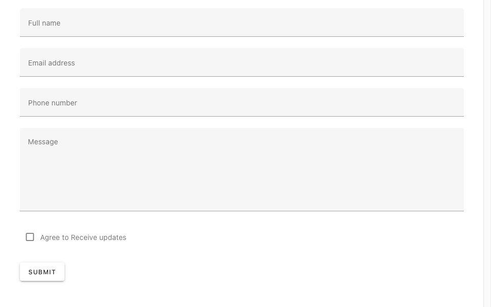
Our demonstration showcases a user-friendly form designed to collect essential information about a contact. This includes fields for the individual's full name, email address, phone number, and an optional message. Additionally, the form incorporates a checkbox to indicate whether the user consents to receiving updates.
Now, let's examine the finalized version of this
Want to learn more? Check out the official Vuetify website and docs: https://vuetifyjs.com/ or you can enroll in the Material UI with Vuetify and Vue.js course by Vue School for a practical guide to crafting your Vue.js app UI with Vuetify.
PrimeVue
PrimeVue stands tall as a comprehensive UI library, packed with over 90 feature-rich components and 200+ icons, PrimeVue caters to building complex enterprise-level UIs. It seamlessly integrates with Tailwind CSS and boasts server-side rendering capabilities, making it ideal for SEO-friendly web applications.
What Makes PrimeVue Stand Out:
- Versatility: From basic buttons and forms to advanced data tables and charts, PrimeVue provides everything you need to build rich and interactive UIs.
- Customization Power: Don't get boxed in by pre-defined styles. PrimeVue offers two modes: styled and unstyled. Choose from pre-built themes like Material or Bootstrap, or tailor the look to your unique vision with your preferred CSS library.
- Enterprise-Ready: PrimeVue is built with robustness and scalability in mind. Its exceptional support service and focus on accessibility make it a trusted choice for enterprise-level projects.
- Mobile-First Design: Build responsive UIs that adapt seamlessly to any screen size, ensuring a perfect user experience on all devices.
- Developer-Friendly: PrimeVue boasts intuitive APIs, comprehensive documentation, and a vibrant community ready to assist you.
Usage
Let's explore the steps involved in creating components with PrimeVue:
//input text
 <InputText type="text" v-model="value" />

//input Number
<InputNumber v-model="value1" inputId="integeronly" />

//button
<Button label="Submit" />

//text area
<Textarea v-model="value" rows="5" cols="30" />

//checkbox
<Checkbox v-model="checked" :binary="true" />
let’s explore a basic form component example with PrimeVue.
import { reactive } from 'vue';

const contact = reactive({
  name: '',
  email: '',
  number: '',
  agreeToTerms: false,
  message: '',
});
</script>

<template>
  <main>
    <form class="contact">
      <div class="grid  gap-1">
        <label for="name" class="ml-2"> Full name </label>
        <InputText type="text" inputId="name" v-model="contact.name" />
      </div>
      <div class="grid gap-1">
        <label for="email" class="ml-2"> Email Address </label>
        <InputText type="email" inputId="name" v-model="contact.email" />
      </div>
      <div class="grid gap-1">
        <label for="telephone" class="ml-2"> Telephone Number</label>
        <InputText type="tel" inputId="telephone" v-model="contact.number" />
      </div>
      <div class="grid gap-1">
        <label for="message" class="ml-2"> Message </label>
        <Textarea v-model="contact.message" rows="5" cols="30" />
      </div>
      <div class="contact-check">
      <Checkbox v-model="contact.agreeToTerms" inputId="updates" value="contact.agreeToTerms" />
      <label for="updates" class="ml-2"> Agree to receive updates </label>
  </div>
      <Button label="Submit" class="submit-button">Submit</Button>
    </form>
  </main>
</template>
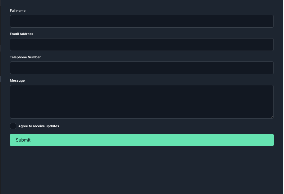
Watch how it appears on our browser.
Ready to dive deeper? Explore the PrimeVue website and documentation: https://primevue.org/
Quasar
This comprehensive framework goes beyond just UI components, offering routing, state management, and a built-in PWA (Progressive Web App) solution. Quasar shines with its performance-focused approach and hybrid mobile app development capabilities.
Here's what makes it shine:
Key Features:
- Vast Component Library: Choose from over 70 customizable Material Design components, covering essential UI elements like buttons, forms, navigation, and more.
- Cross-Platform Versatility: Build native-like apps for web, mobile (iOS and Android), desktop (Electron), and even browser extensions.
- Performance Obsession: Quasar is meticulously crafted for speed and efficiency, ensuring your apps load quickly and run smoothly across devices.
- Progressive Web App (PWA) Ready: Empower your apps with offline capabilities, push notifications, and a native-like install experience.
- Routing and State Management: Organize your app's navigation and data flows seamlessly with Vue Router and Vuex integration.
- Extensive Tooling and Ecosystem: Benefit from a rich set of CLI tools for project scaffolding, development, and deployment, as well as a vibrant community and a wealth of plugins and extensions.
Usage
With our installation of Quasar complete, let’s tackle how we can create some components in the Quasar framework.
//button
<q-btn color="white" text-color="black" label="Standard" />

//input
<q-input v-model="text" label="Standard" />

//date picker
<q-date v-model="date" />
There are plenty more components available to use. We can explore an example of using quasar to build a simple form.
<template>
  <div class="q-pa-md" style="max-width: 400px">

    <q-form
      @submit="onSubmit"
      @reset="onReset"
      class="q-gutter-md"
    >
      <q-input
        filled
        v-model="name"
        label="Your name *"
        hint="Name and surname"
        lazy-rules
        :rules="[ val => val && val.length > 0 || 'Please type something']"
      />

      <q-input
        filled
        type="number"
        v-model="age"
        label="Your age *"
        lazy-rules
        :rules="[
          val => val !== null && val !== '' || 'Please type your age',
          val => val > 0 && val < 100 || 'Please type a real age'
        ]"
      />

      <q-toggle v-model="accept" label="I accept the license and terms" />

      <div>
        <q-btn label="Submit" type="submit" color="primary"/>
        <q-btn label="Reset" type="reset" color="primary" flat class="q-ml-sm" />
      </div>
    </q-form>

  </div>
</template>
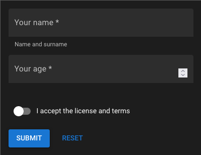
In the example, we have a basic form to gather information from users. Quasar makes it easy to check if the entered data is correct by providing pre-made rules for validation. If you need specific rules, you can create your own using the 'rules' feature. This way, you can also give helpful hints to users in just a few lines of code. Quasar simplifies the process, making it easy for developers to ensure that the data users submit is accurate, with minimal coding effort.
Ready to explore further? Check out the official Quasar website and documentation: https://quasar.dev/
Vuestic

Vuestic is a rising star in the Vue UI library world, offering a fresh, modern design aesthetic and a lightweight approach. Here's what sets it apart:
Key Features:
- Modern Design Language: Embrace a clean and contemporary aesthetic with subtle animations and thoughtful interactions.
- Lightweight and Performant: Keep your app lean and mean with Vuestic's focus on code efficiency and minimal bundle size.
- Focus on Customization: Tailor Vuestic components to your exact needs with powerful theming capabilities and extensive configuration options.
- Growing Component Library: Choose from a curated selection of 60+ essential UI elements, with more components added.
- Accessibility Champion: Vuestic prioritizes accessibility, ensuring everyone can enjoy your app with ease and comfort.
- Smooth Vue 3 Integration: Seamlessly integrate Vuestic into your Vue 3 projects for a clean and efficient development experience.
Usage
Let’s craft some of our common UI elements with vuestic
//checkbox
<VaCheckbox v-model="value" />

//input
<VaInput
    v-model="value"
    placeholder="Placeholder"
  />

//button
<VaButton> Button </VaButton>

//alert
<VaAlert
    description="Hello World! I'm an alert with an important message! I use Primary blue color by default but you can choose another one :)"
  />
Now we’ve looked at a few basic components in Vuestic. Vuestic also provides some utility components to provide some extended functionality
//The va-hover component provides easy access to hover states for any component. To work with hover states you can use either v-model or slot-scoped hover property.
<template>
  <VaHover v-model="value">
    <VaButton
      color="success"
      :preset="value ? 'primary' : 'secondary'"
    >
      {{ value }}
    </VaButton>
  </VaHover>
</template>

//va-spacer is an equivalent for the flex-grow property. It allows you to get more space between flex components.
<template>
  <VaCard>
    <VaCardContent>
      <div class="flex">
        <VaButton>Button</VaButton>
        <VaSpacer class="spacer" />
        <VaButton>Button</VaButton>
      </div>
    </VaCardContent>
  </VaCard>
</template>
Thinking about giving Vuestic a try? Check out the official website and documentation: https://ui.vuestic.dev/: https://ui.vuestic.dev/
Nuxt UI
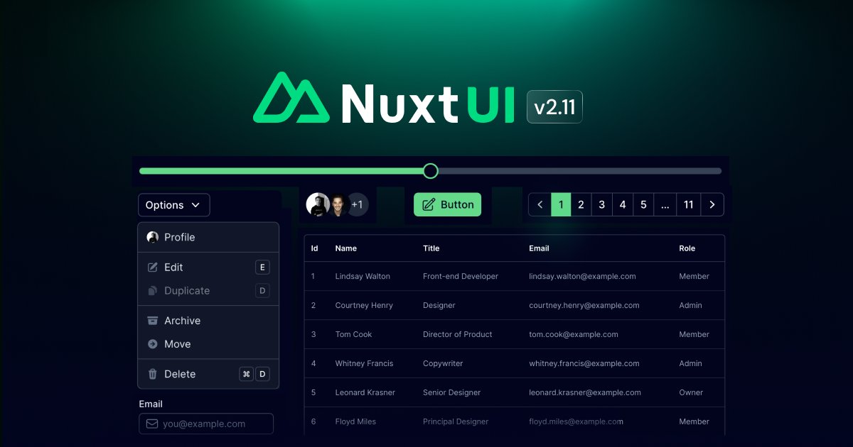
Nuxt UI is a collection of beautiful and robust UI components specifically designed for Nuxt 3 applications. This module has been developed by the NuxtLabs team with Tailwind CSS and Headless UI, its goal is to provide everything related to UI when building a Nuxt app. This includes components, icons, colors, dark mode but also keyboard shortcuts.
Here's what makes Nuxt UI stand out:
- Tailored for Nuxt 3: Components are specifically designed to leverage Nuxt 3 features like server-side rendering and static site generation, optimizing performance and SEO.
- Extensive Component Library: Choose from over 60 well-crafted components like buttons, forms, icons, menus, and data tables, all adhering to a sleek and consistent design language.
- Ready-to-Use & Customizable: Start with pre-built components and easily customize them to match your specific brand identity and project requirements.
- Dark Mode: Easily switch between light and dark themes to cater to user preferences and accessibility needs.
- Extensive Documentation & Community: Get started quickly and find answers easily with comprehensive documentation and a vibrant community of Nuxt UI users.
Usage
Let's delve into a variety of components in Nuxt UI:
//button
<UButton>Button</UButton>

//input
<UInput v-model="value" />

//card
<UCard>
    <template #header>
      <Placeholder class="h-8" />
    </template>

    <Placeholder class="h-32" />

    <template #footer>
      <Placeholder class="h-8" />
    </template>
  </UCard>

//range
<URange v-model="value" name="range" />
Now, let's construct a more intricate component using Nuxt UI:
<template>
  <div class="p-4">
    <UCard>
      <template #header>
        <img
          class="w-full rounded"
          src="https://tailwindcss.com/img/card-top.jpg"
          alt="Sunset in the mountains"
        />
      </template>
      <div class="font-bold text-xl mb-2">The Coldest Sunset</div>
      <p class="text-gray-700 dark:text-gray-300">
        Lorem ipsum dolor sit amet, consectetur adipisicing elit. Voluptatibus
        quia, nulla! Maiores et perferendis eaque, exercitationem praesentium
        nihil.
      </p>
      <template #footer>
        <div class="flex gap-2">
          <UBadge>#photography</UBadge>
          <UBadge>#travel</UBadge>
          <UBadge>#winter</UBadge>
        </div>
      </template>
    </UCard>
  </div>
</template>
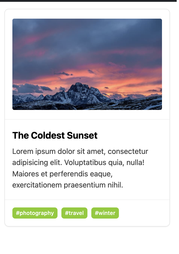
This code snippet demonstrates the creation of a straightforward card component using Nuxt UI and TailwindCSS. Let's take a look at the rendered result:
Do you have any specific questions about Nuxt UI or want me to explore a particular feature in more detail? Checkout the Nuxt UI Official Documentation: https://ui.nuxt.com/
Shadcn-vue
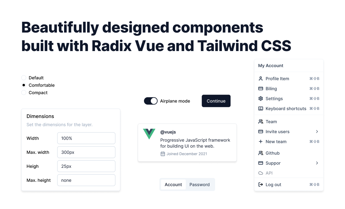
Shadcn-vue is an open-source component library inspired by Radix Vue that provides a wide range of pre-built components for Vue and Nuxt applications. From dashboards and cards to forms and modals, Shadcn-vue has everything you need to create a beautiful and functional UI.
Why Choose Shadcn-vue?
There are many reasons why Shadcn-vue is a great choice for your next project:
- Open source and customizable: Shadcn-vue is open-source, which means you can customize the components to match your specific needs and branding.
- Variety of components: Shadcn-vue comes with a wide range of ready-to-use components, saving you time and effort when building your UI.
- Easy to use: Shadcn-vue is well-documented and easy to use, even for beginners.
- Lightweight and performant: Shadcn-vue is lightweight and performant, so it won't slow down your application.
Usage
Let’s look at how to craft components with shadcn - vue.
//button
import { Button } from '@/components/ui/button'
<Button>Button</Button>

//input
import { Input } from '@/components/ui/input'
<Input />

//alert
import { Alert, AlertDescription, AlertTitle } from '@/components/ui/alert'
<Alert>
    <AlertTitle>Heads up!</AlertTitle>
    <AlertDescription>
      You can add components to your app using the CLI.
    </AlertDescription>
  </Alert>

//tooltip
import {
  Tooltip,
  TooltipContent,
  TooltipProvider,
  TooltipTrigger
} from '@/components/ui/tooltip'
<TooltipProvider>
    <Tooltip>
      <TooltipTrigger>Hover</TooltipTrigger>
      <TooltipContent>
        <p>Add to library</p>
      </TooltipContent>
    </Tooltip>
  </TooltipProvider>
Now let’s tackle a couple of more complex components
<script setup lang='ts'>
import { Card, CardContent, CardHeader, CardTitle } from '@/components/ui/card'
import {
  Select,
  SelectContent,
  SelectItem,
  SelectTrigger,
  SelectValue,
} from '@/components/ui/select'
import { Input } from '@/components/ui/input'
import { Label } from '@/components/ui/label'
import { Button } from '@/components/ui/button'
</script>

<template>
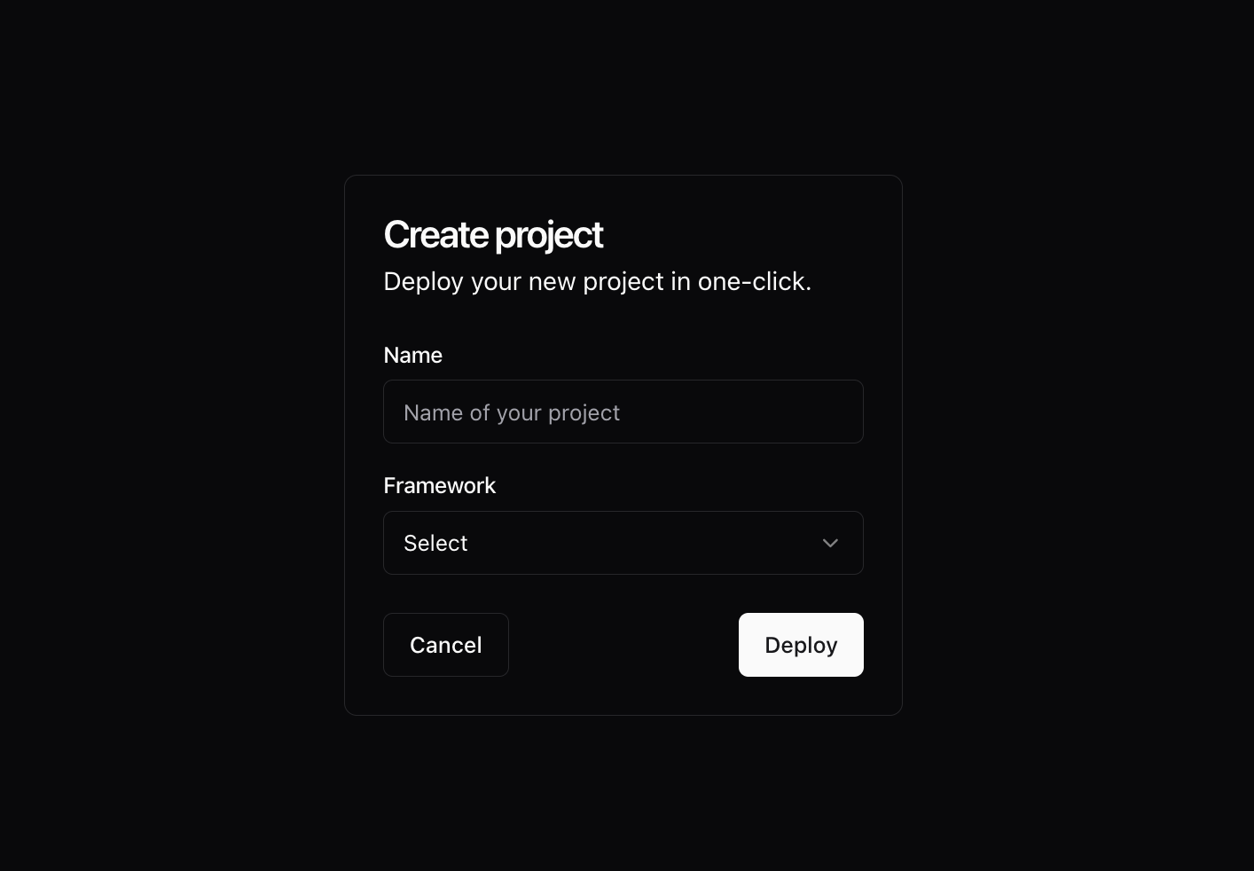
  <Card class="w-[350px]">
    <CardHeader>
      <CardTitle>Create project</CardTitle>
      <CardDescription>Deploy your new project in one-click.</CardDescription>
    </CardHeader>
    <CardContent>
      <form>
        <div class="grid items-center w-full gap-4">
          <div class="flex flex-col space-y-1.5">
            <Label for="name">Name</Label>
            <Input id="name" placeholder="Name of your project" />
          </div>
          <div class="flex flex-col space-y-1.5">
            <Label for="framework">Framework</Label>
            <Select>
              <SelectTrigger id="framework">
                <SelectValue placeholder="Select" />
              </SelectTrigger>
              <SelectContent position="popper">
                <SelectItem value="nuxt">
                  Nuxt.js
                </SelectItem>
                <SelectItem value="next">
                  Next.js
                </SelectItem>
                <SelectItem value="sveltekit">
                  SvelteKit
                </SelectItem>
                <SelectItem value="astro">
                  Astro
                </SelectItem>
              </SelectContent>
            </Select>
          </div>
        </div>
      </form>
    </CardContent>
    <CardFooter class="flex justify-between px-6 pb-6">
      <Button variant="outline">
        Cancel
      </Button>
      <Button>Deploy</Button>
    </CardFooter>
  </Card>
</template>
Our Component is rendered as:
Choosing the Right Library:
The best UI library for your project depends on your specific needs and preferences. Consider factors like:
- Project requirements: Do you need a comprehensive set of components or a lightweight solution?
- Design aesthetic: Do you prefer Material Design, a modern look, or something entirely custom?
- Technical expertise: How comfortable are you with customization and styling?
- Nuxt 3 integration: Do you need features specific to the Nuxt 3 framework?
Wrapping Up:
With the abundance of fantastic UI libraries available, building stunning UIs in Vue 3 and Nuxt 3 has never been easier. Take your time, explore your options, and choose the library that best complements your vision and technical expertise. Remember, the perfect UI library is the one that empowers you to create captivating and functional experiences for your users.

Click to load comments...